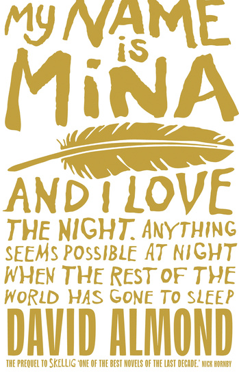
I was recently asked to help judge a fiction prize at the junior campus of my local high school. Sixteen students from years 7, 8 and 9 submitted pieces ranging from half to eleven pages. The winner and runner-up were easy enough to choose; the first was well-written and the second was a cracking yarn. The third place went to a piece of comic writing, and there were a couple of ‘special mentions’ for an intriguing piece of micro-fiction and for experimentation in a variety of genres. Reading and then talking about the stories with my fellow judge was a real pleasure. Well, mostly.
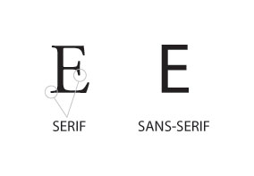
What was not pleasurable was reading nearly all of these stories printed out in sans serif fonts. Serifs are the little bits at the tops and bottoms of these letters here… Or better put by the Oxford dictionary, ‘a slight projection finishing off a stroke of a letter.’
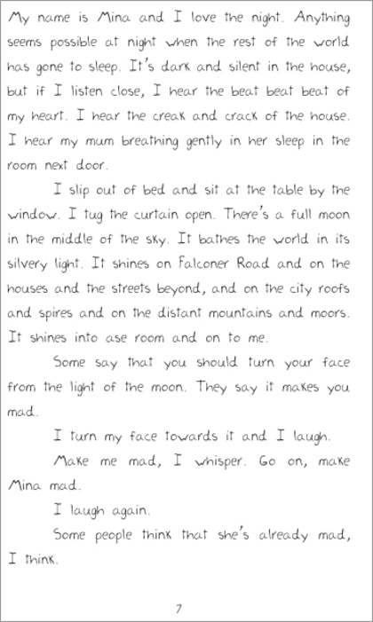
Now, you might say, ‘Font? What’s the big deal?’ The deal is, that I found the ones printed using a sans serif font hard to read. I’m no expert on the history of typefaces, but I think that the reason fonts with serifs are almost always used in books is because they are easier on the eye when you’re faced with large blocks of text. And another reason is maybe I’m just used to reading pages with a particular range of fonts. (And I am getting to My Name is Mina – don’t worry. Here we are…) After loving David Almond’s A Song for Ella Grey, I thought I’d like to read some more of his books, so I borrowed My Name is Mina from the library. I was more than a wee bit peeved to find this when I opened the book at the first page….
‘Grrr! One of my pet hates,’* I thought. ‘So I am going to hate this book.’
I managed the student’s stories because they were relatively short. Here was a whole book, not just in this handwriting abomination, but also in a number of different styles of hand-lettering and type.
I made myself start reading. I made myself keep reading, for a few pages.
And you know what happened? Then I just read on. And on. I loved Mina.
The moral of the tale is this – serifs may rule on the printed page, but I can cope with whatever when I love the story.
*The other one is dialogue without talking marks.


Hey Susan,
Been meaning to write and say Congrats on your new Verity! I too love Mina (and Skellig)
xsimmone